Graphic Design

Astroarcade
Retro Games
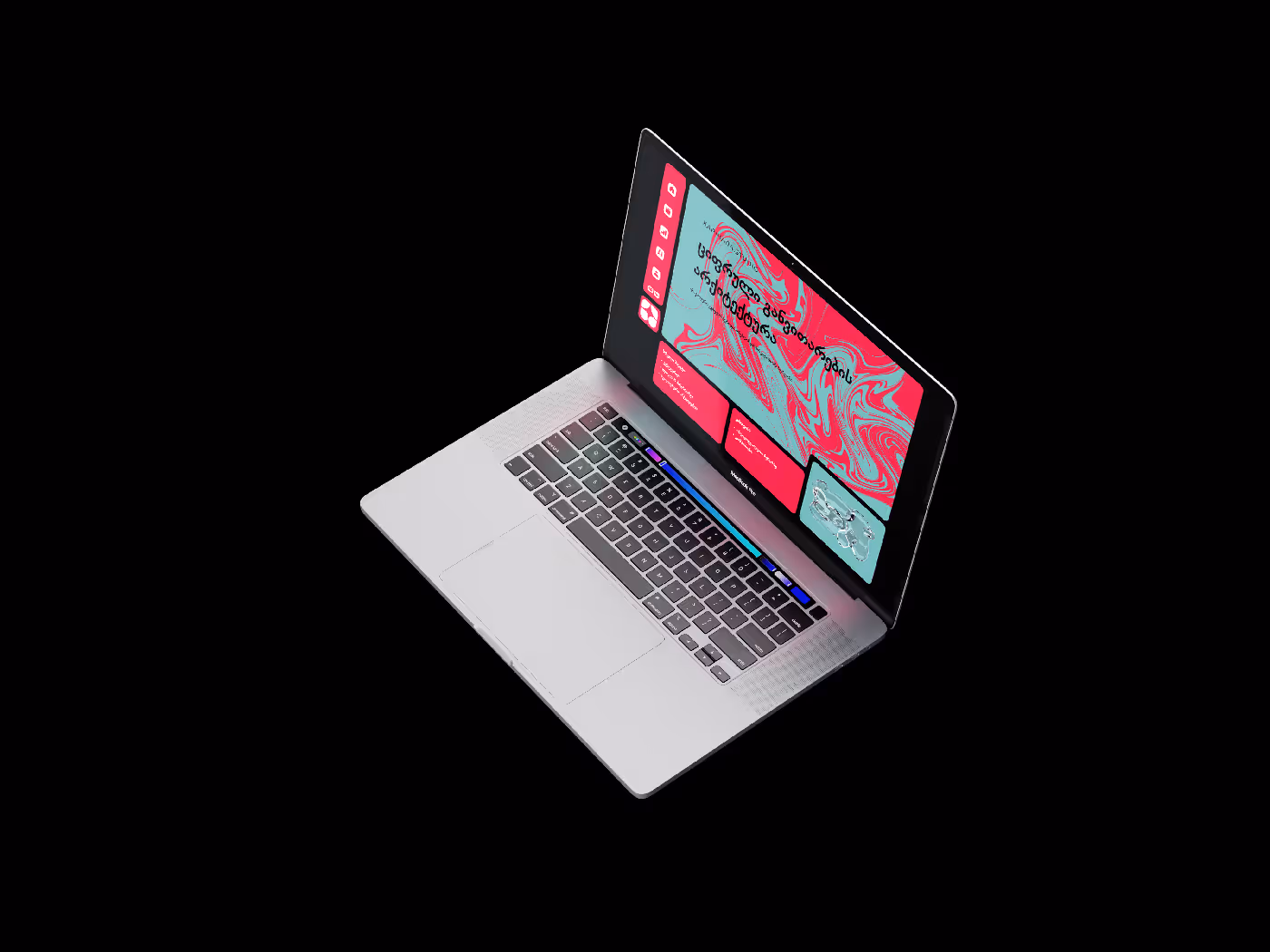
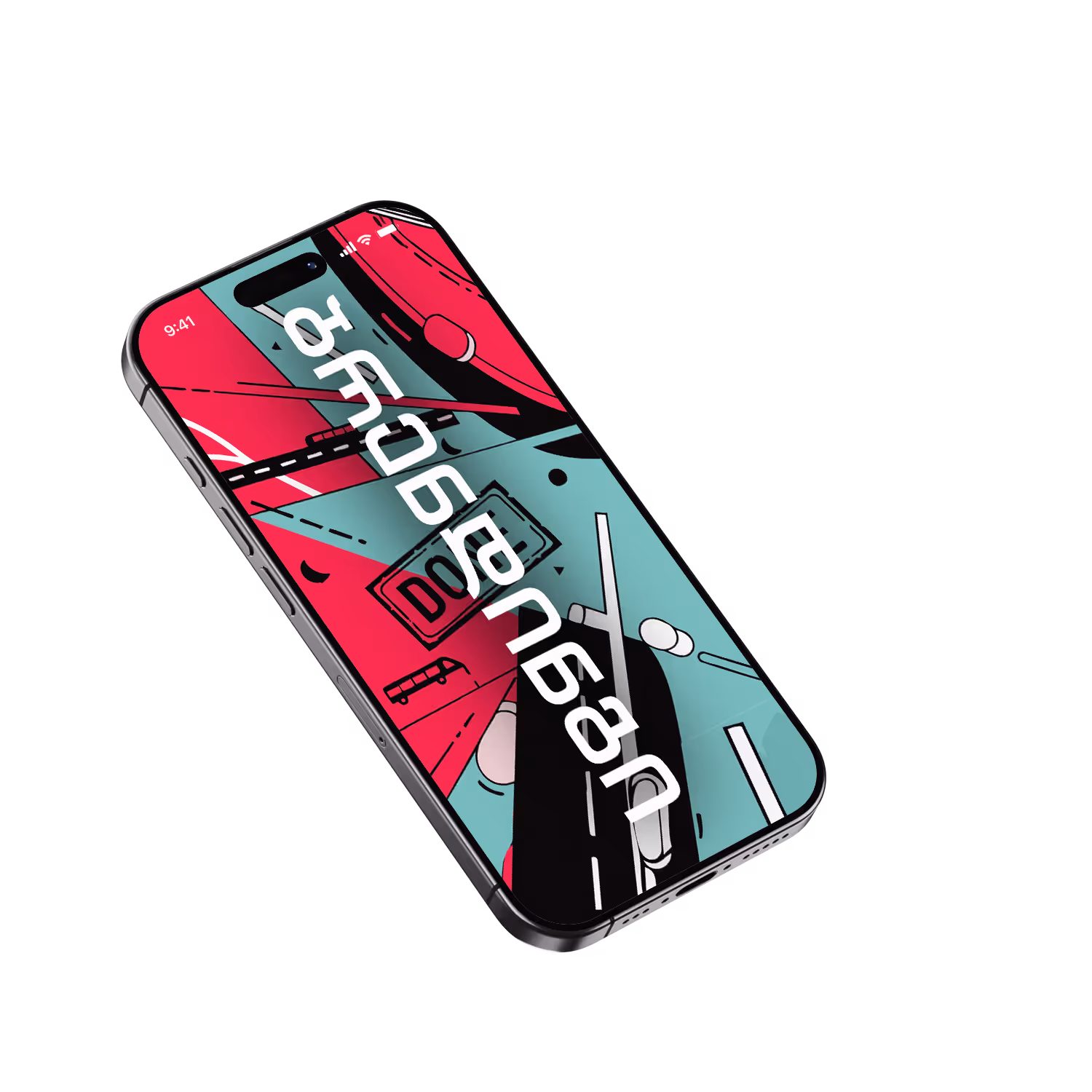
Visual Identity Design for an Entertainment Center
Client:
Astroarcade

The Challenge
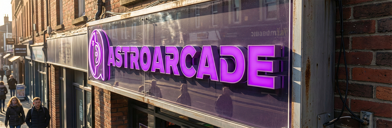
The client requested a logo for an arcade entertainment center that would visually bridge two key elements:
- The Letter 'A' (Arcade/Astro): A clever integration of the lowercase letter 'a' into the logo’s central figure.
- Space Theme: Evoking a sense of adventure, futuristic entertainment, and cosmic gaming.
The task was to seamlessly and harmoniously merge these two distinct concepts into a single, memorable graphic mark.

The Result
The final logo successfully addresses the challenge by creating a clever visual metaphor:
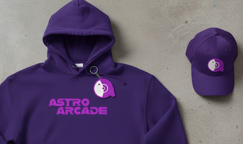
- Visual Fusion: The graphic mark features a stylized astronaut helmet, where the contour precisely mimics the shape of a lowercase letter "a." The helmet’s circular visor (forming the bowl of the letter "a") contains a star, reinforcing the cosmic theme and giving the logo a dynamic, arcade-inspired aesthetic.
- Color & Mood: The design utilizes an energetic Purple palette, creating a retro-futuristic, neon aesthetic characteristic of classic and modern arcade gaming.
- Typography: The wordmark "ASTROARCADE" is set in a bold, rounded typeface that visually complements the graphic mark, ensuring a cohesive and powerful brand identity.
Through this fusion, the logo becomes more than just a symbol for a gaming center; it serves as a prime example of creative design where conceptual requirements (the letter A) and thematic storytelling (Space) unite perfectly.